Please get in touch via the contact form if you experience any issues with this release.

This patch addresses an issue with Window Mode freezing or crashing on some versions of Android. The details of the last release are below.

Background running removed

I’ve always wanted DigiHUD to be able to run in the background. For my own use it’s great I can start the app, reset the values and drop it in my pocket knowing that my walk will be recorded. It’s caused some confusion though, especially for people who don’t expect it to carry on running when they hit Home, but generally it’s been seen as a great feature.

Google have recently, and quite rightly, started to crack down on what apps can do with the device Location. Starting in Android 10 (P), apps that need to access the device Location in the background must specifically request permission and only to perform a function that the app relies upon for normal operation. In August this year all new Play Store apps will be reviewed by Google to ensure they have a very good reason to access Location in the background, and in November all existing apps will be reviewed. Any apps that can’t meet the new requirements will have to stop using background location or be removed from the Play Store.

Even if you can justify using it, Google are placing restrictions on the frequency that background location can be received, here’s a quote from their guidance (linked to below):

If background location access is essential for your app, keep in mind that Android preserves device battery life by setting background location limits on devices that run Android 8.0 (API level 26) and higher. On these versions of Android, if your app is running in the background, it can receive location updates only a few times each hour.

Google Developer documentation

For a speedometer app, this frequency of updates is as good as useless. The majority of DigiHUD users are using Android 8 or later. I’m not prepared to provide a feature that I know is not accurate as this would undermine confidence in the app and have a negative impact on it’s reputation, so this has unfortunately forced my hand and I’ve removed background running from the app. I’m very unhappy about having to make this change but have no other option.

Start on power connected

A while back Google stopped apps from creating a ‘listener’ that would run in the background listening for certain system events, in the case of DigiHUD Pro it was the event that let the app know when the power cable was plugged in. That broke the ‘Start on power connected’ feature.

Previously, apps could start a ‘Listener’ Service which would survive reboots, and therefore the app itself didn’t need to be run for the Service to start.

I’ve had to create a workaround for this by starting a service when the app closes (if the Setting is checked). As per Google’s guidelines the service adds a Notification so you can see that it’s running. Tapping the notification will also open the app. The notification also has a ‘close’ option to kill the service.

Unfortunately this means that the app has to have been started manually and closed since a reboot for it to detect when the power cable is connected.

A fix for ‘Close on power disconnected’ has also been added.

Improved layout

There’s an improvement to the speed digit layout as I felt the speed wasn’t taking up as much space as it could (or deserved). The digits can now resize to fill the space available. There’s still more to do in the future with regards to layout.

Larger digits make better use of the screen area.

Show two digits under 100

Driving as I do in the UK there aren’t many occasions when I need a speedometer that goes above 100 mph. Travelling in France it was fine as I was regularly driving above 100 kmh. So, for day to day driving it’s pointless the app showing me three speed digits, especially in portrait mode where the digits are small anyway. That’s why I’ve added a new setting “Always show three speed digits?“. It’s unchecked by default, but if you always want three speed digits then just check it.

Speed precision to 1/10th enabled

Google Map View

Fixed:

  • Google map would redraw the map completely when the location updated causing the map to flash. it appears that this could also cause the app to crash on some devices
  • Blue line indicating the route (appears when the route is being recorded) would draw from the equator to the current location
  • Map not re-initialised after screen rotation events
  • Routes viewed in Google Earth showed broken way-point icons

Feature descriptions added

I’ve added brief descriptive text to some of the dialog boxes. It’s not always clear what these features do so hopefully this will help.

Bug fixes

  • Found and fixed a bug that could stop some of the recorded routes being displayed. This was happening when trying to get the address from lat/lon coordinates.
  • Ensure that the timer and elapsed time (used in the calculation of average speed) continue regardless of whether location updates are happening. This should improve accuracy of the average speed.
  • Window Mode crashing

Minimum Android version increased to 16

The minimum version of Android that the app will now run on is 16. Earlier versions of android will keep the previous applicable version.

Loading

So an updated version of DigiHUD Pro was released the other day to fix a couple of bugs and add some new features (take a look in the Play Store listing for the details).

I also was required by Google to ensure my apps target Android 8.0 if updated from 1st November 2018:


It’s taken so long to get this update out because Google have made it increasingly difficult impossible to support the later versions of Android and use a third-party development environment, which in my case was Eclipse. I’ve nothing against using Google’s Android Studio it’s just that everything was setup perfectly and I was happy the way it was.

I resigned myself to the fact I had to switch and set about migrating. Oh if only it was a one-click job! Being new to Android Studio meant having to learn how everything worked whilst I re-created the apps in it. What a nightmare that was.

I digress. I realise now that a simple run-through of the app just wasn’t enough and that I hadn’t understood the gravity of moving to the later APIs. Some things that have worked since day one are now broken and I must either find a way to fix them, or remove them.

Here’s an example.. You can get the app to start when the device is connected to power, and you can get it to close the app when it disconnects. It was really simple to implement using system ‘Broadcasts’ (think “Hey everyone, the power got connected”), and “Receivers” (“The power was connected, I need to do XYZ”). This has now changed, I believe to reduce the amount of processing apps do while they are idle in the background or when not running at all. It helps reduce battery use which, of course, is a good thing.

Unfortunately these were two of the features I didn’t think to test on an Android 8 or 9 device.

Hopefully the next update will be out soon.


Loading

I had an email from Eric Lee over at Hudly to let me know that the team at Hudly are working on a sleek new wireless model and it’s up on Kickstarter now.

Go check it out here: https://www.kickstarter.com/projects/ericshun/hudly-wireless-focus-on-the-road

DigiHUD looks great on it’s large 6.2″ display.

Loading

I received an email today from Hudly again thanking me for being a backer but also to say that backer’s units have now shipped.

I’m not sure how long it will take for my unit to make it’s way from the USA to the UK, hopefully not too long as I’m dying to get it installed and see first hand how well it works. I’ll probably have to pay import duty on it however.

I’m super excited to get my hands on Hudly, however I’m not sure yet if my Android LG G5 will be compatible with it as it uses MHL to connect Android devices. I’m sure I’ll be able to use my Galaxy SIII.

I’ll add a write-up on the unit to this blog after putting it through it’s paces.


Fancy getting Hudly?

You can get $50 off a Hudly until 17 May 2017 by using this link


Loading

As anyone who has tried to use DigiHUD’s HUD mode in the day will confirm, it’s not really usable because it get’s washed out to the point where it becomes invisible. Add to this the slight double image caused by the laminated glass and it’s a non-starter.

In order to work well in the day, commercially available HUD units have particularly bright displays (generally brighter than smartphone or tablet screens) and also a piece of slightly reflective film which is stuck to the inside of the windscreen. The film removes the double image and also allows the display to be seen in bright light.

Recently I picked up a piece of film from that popular Internet auction site to see if it improves DigiHUD’s HUD experience.

Here it is in the day.
20160826_194750_hdr

I’ve attached it up high on the screen because the rake of the glass would mean the film was a bit too much in my line of sight for comfort. I will at some point 3D-Print a holder for my phone to sit on the dashboard.

So for a few pounds it makes a world of difference to using HUD mode in the day.

Loading

I saw a review of the free version of DigiHUD today that mentioned the maximum value of the trip counters. Here’s Ryan Scott’s review:

Really like this app and use it exclusively to accurately log mileage on my Dodge diesel to track mpg’s. I only give it 4 stars due to trip meters only reading in the thousands. I would consider paying for the pro version if the trip meters read higher.

I realised that it’s not in the description or the app itself what the maximum values are, for either the free or Pro version. It’s impossible to put everything that the app can do into the description because of the character limit.

Putting it all in the app itself is either too late (because it won’t be installed if you don’t know about some ‘killer feature’) or it just won’t be seen. Nobody wants to read a huge pile of text about what the app can do or how to use it, I get that, and apps should be intuitive and not need instruction manuals. You probably don’t want to see a huge window open when you start the app listing its features and giving instructions on how to use it.

Here’s a Pro screenshot showing how the values can be set to show greater precision and also the number of digits the trip counters can have. That’s a million miles/kilometres.
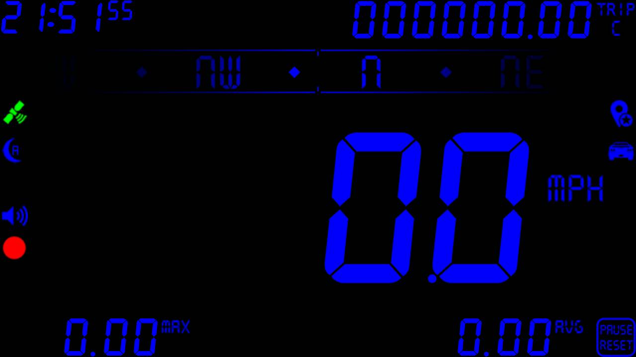
DigiHUD Precision

Trip counter showing optional leading zeros

It’s worth mentioning that the free version also shows some values to two decimal places when in landscape view.
 

Loading

Do you have any video of how you use DigiHUD? Have you video’d something really cool you used DigiHUD for, like finding the top speed of a model aircraft or RC car?

I’d love to see them and also create an interesting short video for the Play Store listing.

Please email the address in the app listing, of fill in the Contact Form if you have something you want to share.

James.

Loading

I plan to get a video of two phones side by side in a car with one running the internal GPS receiver and the other running an external receiver but for now here’s a short video of the Pro version in a test mode, taken using screen capture.

It shows the difference in update speed very well but because it’s not in a car where you can see the road for reference it doesn’t give a good view of how the lag is reduced.

The test runs continuously from 0MPH to 121 and back to 0.

Loading

One thing I’ve really been wanting to try for a while is just how well DigiHUD performs when using a better GPS receiver than the ones built into our devices, and today I got the chance to do just that.

As anyone who has used the app, or similar GPS location based apps will know, phones have very slow GPS location updates, which is shown by the slowness in updating the speed. Try accelerating and watch the app and your speedometer and you’ll see that the app is at least a second or more behind.

Generally the update rate will be somewhere around 1 per second (1Hz) for built-in GPS, and that means that no matter how fast and efficient the app is there’s going to be a noticeable delay between travelling at X mph and the app displaying it. This is partly why I’ve had no interest in writing a 0-60/0-100 timer. The accuracy just isn’t good enough for me to be happy with the results.

To verify the update rate I’ve written a basic test app that times GPS updates and shows the average updates per second and the number of updates for as long as I run the app. Interestingly, my LG G3 was 1.00/sec and my Samsung Galaxy S3 was 1.01/sec, after both received 365 updates.

Today I received a dedicated high accuracy, high(er) refresh rate, external Bluetooth GPS receiver from Amazon. Here’s the Amazon item if you’re interested.

I took a few quick snaps of the unit itself and the box, but not the included accessories: a USB to Mini USB lead and a Mini USB car power lead.

The box

The GLO in it’s box.

Box detail

Box detail, showing contents and GLONASS compatibility.

It’s not that big at 75mm x 40mm x 18mm, and weighs about 272g. There’s a USB connector on the side below the power button and the included cables have straight plugs unlike the angled one bundled with my Garmin SatNav.

The unit itself turned on

The unit itself turned on.

Manual, and a penny to show how small the unit is

Manual, and a penny to show how small the unit is

Underneath with it's grippy feet

Underneath with it’s grippy feet.

Set-up for use with Android was painless following these excellent instructions and it was paired with my phone in seconds.

I installed ‘Bluetooth GPS’ from the Play store and configured it as the link above describes. The app can be started/stopped very simply from a widget. It also goes to sleep if the Bluetooth pairing stops.

I could now test it and found that it was averaging just over 7Hz after 1000 updates.

Test app

Test app

It’s extremely hot here tonight and I want to try this again when it’s cooler and also outside to see if this makes any difference, after all this unit is capable of 10Hz.

I was able to take the unit for a run out in the car earlier wondering how well DigiHUD Pro would cope with a higher refresh rate. I know the app moves a lot of images around on screen and can get quite memory hungry, especially the compass, even though I’ve tried very hard to manage memory as best I can.

Oh wow. Performance was like night and day! It was so much faster updating and the lag was gone. I was really pleased to see DigiHUD keeping up with the car speedo when accelerating and decelerating. When I slowed to a stop (even quickly), both speeds hit zero at the same time. I was actually shocked at how well my app performed. The graphical compass moved way more smoothly too. It really put a smile on my face!

So it’s early days with the Garmin GLO but from a couple of short tests I’m already blown away by it and will not want to go back to using the phone’s GPS sensor. No thank you! I’m also really pleased with how my app performed, it never missed a beat, although it has shown that I’ll need to change the way the satellite information is deciphered as it thought that GPS was unavailable.

I’ll be leaving a 5* rating on Amazon for the Garmin GLO.

Loading

Back when I was building the initial app I was using an HTC Wilfdfire, and after that a Samsung Galaxy S3, and life was good. These were the only Android devices I’d used (or seen) and it turned out that these phones were lulling me into a false sense of security – every device has a hardware menu key, right? Wrong.

DigiHUD was always meant to be a full-screen app, with none of the Android furniture like a status bar to detract from it’s purpose in life – to show the information as simply and cleanly as possible. In HUD mode especially, and with the usual issue of a double image due to laminated glass, it needs to be as clear as possible. What use is a status bar in HUD mode?

So I’d built a simple full-screen app with a menu accessible by the menu key. Job done. Well, it was…until I unleashed it on an unsuspecting public and more and more people started using it. Suddenly I found that if you were using a tablet then you could basically change no settings at all, except those just needing a press on the item itself (like the speed unit). Feedback poured in.

I’d decided that I could open the Menu by tapping on the screen. For me this was very natural to use as a single tap gave me all of the options available, and this worked well as an alternative to a physical menu key (or as well as), until I found that for some reason it didn’t work on tablets!

Google weren’t helping either:

Beginning with Android 3.0 (API level 11), Android-powered devices are no longer required to provide a dedicated Menu button. With this change, Android apps should migrate away from a dependence on the traditional 6-item menu panel and instead provide an action bar to present common user actions.

Now I have to provide an Action Bar, just to expose the Menu? Great. What about my full-screen cleanliness?

My eventual solution (after a lot of trial and error and changing of code) was to

  • keep the screen-tap menu
  • make the menu available to a physical menu key if present
  • offer the option of showing the Action Bar if desired
  • always show the Action Bar for devices identified as Tablets (I’m at the mercy of Android to correctly identify tablet devices here)

If all device manufacturers followed Samsung’s example and included a hardware menu key then I would have saved many hours working on this ‘simple’ issue. Or if Android always exposed a menu icon in the software navigation that would help too (I think HTC do with their later phones like the M8). Instead, for devices with no hardware keys, we lose more screen real estate by showing the software navigation and an Action Bar.

Although my solution may not be the most elegant or seamless it does at least allow the Menu to be available on all devices. I have a game installed that relies on a hardware menu key and is therefore as good as unusable on my LG G3.

Pro Menu

Pro Menu


Loading